“It looks childish.”
That was the first reaction I heard to iOS 7. I’m not going to lie, when I saw it for the first time myself, I freaked out a little too. Like any good simplicity-loving designer, I was eagerly waiting for Jonathan Ive to reveal a fresh, clean take on iOS.
But the icons that were unveiled feel rushed. Lots of them look like the very first sketch was thrown right into the keynote.
My developer friends had similar reactions, but they couldn’t put their finger on why they felt that way. That’s because there are tons of tiny details that go into designing app icons that the average person doesn’t ever think about. You may not recognize the details, but you will feel their effects.
Even designing just one simple, clean, good-looking icon is not an easy task. Multiply that by 25 and there was a ton of work to do in the 8 months since Forstall was booted, which led to certain things being overlooked…
Poor choice of color.
To be honest, Apple’s software has had this problem for a long time. For hardware design it’s not a problem because their signature gray aluminum will take on different hues and shadows depending on its environment. But in software, a dull gray will always be a dull gray.

Calculator is a great example where poor color choice can ruin an icon. Actually if we’re being completely honest, its colors look like they were pulled straight out of Windows Metro. (And that’s not a good thing!)
On Dribbble, Jackie Anh came up with a much more aesthetically appealing icon. Just by slightly tweaking the orange, adding a subtle gradient, and getting rid of the dull grays, the icon feels noticeably better. And it’s even more harmonious with the overall tone of iOS 7.

On the opposite end of the spectrum you have apps like Phone, FaceTime and Messages that use extremely saturated and low contrast colors. Colors that my high school art teacher would have referred to as “straight from the tube”, meaning taken directly from the tube of paint without thought.
Just like you don’t want to use pure black, you also never want to use “straight from the tube” colors. They come off as tacky and cheap.
Drawing from the fashion world, there was a period of time where you’d find hipsters around town wearing neon clothing, but they’ve long since passed neon onto the bros. Never take fashion advice from the bros.
Weak use of metaphor.

The Contacts icon is also screaming for some creative help. For one, the colors are very uninspired. There’s that dull gray again.
But the bigger problem with this icon is that it’s still sporting the address book metaphor! This new iteration of iOS was supposed to save us from the unnecessary skeuomorphism that Jobs and Forstall loved. And from what I’ve seen, the Contacts app has largely done that… everywhere except the home screen!
Has anyone even seen an address book in the past 10 years?
I tried to think up some interesting ideas for Contacts, but I couldn’t come up with any. And I realized, I don’t even use the Contacts app. I threw it into my “Junk” folder years ago.
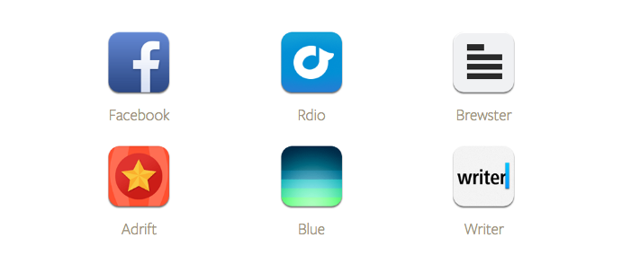
When I need to call someone I go to Phone. When I want to see a friend I go to Facebook. If I really wanted to maintain a list of friends I call a lot on my home screen, I’d use an app like Brewster. Apple could remove the Contacts app and I’d never notice. (I’ll come back to this later…)

On the topic of skeuomorphism, is a pad of perforated paper really the best we can do for Notes? We’ve traded the old, nicely rendered icon for the new one which looks like a sketch from OmniGraffle with no new take on the metaphor.
I don’t necessarily think the pad can’t be done well. Squarespace Note is my favorite example of a clean notes icon: slightly skeuomorphic, but still incredibly simple at the same time.

Videos still maintains its unhelpful skeuomorphism too. I’ve never associated those black and white stripes with videos. I realized why a couple minutes later, because those stripes for for movies, not videos.
If they wanted to be contemporary, they’d include the “play” icon, like Graph Concepts did on Dribbble. It’s an icon everyone is familiar with from YouTube, Vimeo, Vevo, or any other video that’s been watched on the internet in the past ten years.
That’s the icon that will scream “videos!” the fastest.
Inconsistent language.

The new Camera icon is probably my least favorite of all the new icons. It is just plain inconsistent with the rest of the design language across iOS 7. In an aesthetic that is all about reducing to until only the absolutely necessary remains, why does the icon need extra hairlines, a yellow flash and a extra little button?
All of it is excessive. And even worse, the camera icon on the lock screen isn’t even the same one. Why?
I actually loved the original Camera icon. It was beautifully geometric and abstract. It wasn’t skeuomorphic at all, it was a literal representation of the hardware on the other side of the phone. (Especially when you remember that the first generation iPhone had an aluminum case.) It was like you were invoking the camera right on the other side of the phone by magic.
All of that magic has been replaced by an ugly camera icon. This new icon is like showing a floppy disk for “Save”. Instead of seeing a representation of the actual hardware that would be doing your bidding, now we’re left with a old-timey camera.

Reminders is another huge let down. To be honest, the app has always been a let down. Unless you use Siri it’s impossibly hard to create a new reminder, which is 90% of the app’s use case.
It feels like Reminders was a sacrifice that Apple knew it wasn’t going to be able to redesign this time around. It is, as far as I can tell, the only interface in iOS 7 that still features an uninspired pseudo-paper texture. Reminders are quick, one-off items… they definitely shouldn’t be letter-pressed into my phone.
The icon feels uninspired as well; it’s a casualty of the grid system. In this case it looks like there wasn’t really a clear direction for its design, so a few random elements were aligned on the grid and that was that. It doesn’t live up to the quality we expect from Apple.

Speaking of inconsistent, I honestly have no idea what’s going on with the Game Center icon. Apple ditched the glossy aesthetic everywhere but in those glass spheres. If the spheres perfectly expressed the “game” metaphor I might be able to forgive them, but they aren’t really special in any way.
Apps that shouldn’t exist.
Like Contacts, some of the other default apps should be cut. There, I said it. It sounds like a entirely separate problem, but I actually think it shows up in the icon design because they get neglected more than others.

Stocks is one of those apps. As imagined, it doesn’t suit the needs of anyone who actually need to check their stocks, but it’s never been cut after all these years. To be fair the Stocks icon has never really looked good. It just used to hide behind all that gradient and gloss, so no one noticed.
But now that Apple’s gone “flat” it’s so much harder to hide. The lines on the new dark icon feel very brittle, just like the lines on Reminders and Notes, and instead of the green or red that make an appearance in the app itself, the accent color is a weird light blue.

iTunes is another app that, in a perfect experience, wouldn’t exist. You know how you can tell? If you remove the circle from its icon, what do you get? The Music icon with a different color. Why? Because everything iTunes does for music should actually be in Music! And everything video-related should be in Videos…
And keeping repeating until the iTunes app has no content left.
A few successes.
Of course there are also a few icons that I think are well done. Icons that nailed the balance between adhering to the new aesthetic and expressing the soul of the app they represent. I don’t hate everything!

One of the best icons in the group is Music. You might be thinking, “What the heck Ian that’s another neon color!”, and you’d be right.
But Music nailed its color. It wasn’t straight out of the tube, it was carefully chosen. That pink orange successfully evokes MTV or VH1 or VEVO or Taylor Swift. It really feels like “music”.

Calendar is another great one. The old icon was probably the ugliest of all the iOS 6 icons. And it was due in large part to poor color choice: using pure white to make highlights and pure black to make shadows.
The new Calendar icon on the other hand is simple, but does its job perfectly: showing us the current date.

Speaking of which, the Clock icon now keeps the current time as well, which is a nice addition! The icon itself features only minor tweaks from iOS 6, but each change was a careful improvement: the unnecessary black loop was removed, the extra gloss was removed, and the hands were slimmed, and the numerals are now Helvetica to match the rest of the interface. Perfect.

There are also a few icons that you also don’t see on the home screen that are very nicely designed. I could only find these three in Apple.com’s promotional content. They’re all beautifully simple, made up entirely of geometric shapes and clean lines. If Apple applies this kind of quality to the rest of their icons in the time between now and when iOS 7 ships we’ll be in for a real treat.
And a few missed opportunities.
I really like the idea of icons that adapt to their environment to be helpful to the user. Clock and Calendar are obvious examples, but the idea could be taken a lot further.
Stocks is another icon that could actually be put to work for the user. Why not show me the fluctuation of my entire portfolio in the trend line of the icon? Better yet, if my portfolio is up, turn the icon green. Down? Red. That way I can quickly gauge my performance without needing to open the app all the time.
Color with a purpose! No portfolio setup? Show me the S&P 500!

Newsstand is another missed opportunity. Even though it was universally hated for not being folder-able on iOS 6, it was still unique in that it changed based on content curated by the user. That’s interesting!
The new icon has some nice, old-school looking magazine cover designs, but it doesn’t convey the future of news like it should.

On a similar note, other icons could become personalized, like Music, Videos or Photos showing the last album cover, video, or photo you engaged with. Surely each of those have good-looking-enough artwork to pull it off. Make my home screen feel a bit more personal. (Angry internet people calm down, I’m aware that Windows Phone does similar things, but that doesn’t mean Apple shouldn’t too.)

Or another random idea: what if Camera was still a lens like it used to be, and in the lens was the reflection of the last photo you snapped! Useful? Absolutely not! But playful at least.
I wish there were more misfits, rebels and troublemakers ideas in the icon design for iOS.
I’m not too worried about the future though.
I freaked out in the beginning because I thought the crummy icons were representative of Apple screwing up the entire new design direction for iOS. But now that I’ve seen the rest of iOS, I’m not that worried.
Yeah the icons are below standard, but the rest of iOS 7 looks damn well done—lots of really strong interaction design. If I really had to pick between icon design and interaction design, I’d obviously choose the interactions.
One thing I realized is that an icon’s job is to convey the soul of the app itself, and lots of the apps are still undergoing major redesigns. Redesigns that will probably not be perfected until iOS 8 at least. So we shouldn’t expect their icons to be perfect yet either.

What’ll be really interesting is to see how companies adapt their icons and interfaces to iOS’s new feel. Honestly, Rdio’s and Brewster’s apps already feel like iOS 7; they’re minimal, clean and airy.
As far as icons go, every other company has a lot more skin in the game than Apple does too. Their success is directly proportional with the amount of times their icons are pressed, so they spend a lot more time making them perfect. Imagine what Blue could do if they were allowed to make their icon reactive.


